Daktela Brand Guide
Brand guidelines rule.
Looking for our logo? The right colors? What does it all mean? Are we alone in the universe? Learn all this and more in this handy brand guide... You can also:
Download full Brand Guidelines PDF to go
Our Logo and Symbol
From working with VoIP technologies primarly for call centres to all-in-one application for customer service care. Daktela‘s mission is to foster connections that are both productive and comfortable. Our logo symbol features 2 sides of a dialogue coming together, a connection of 2 entities which results in more than just the sum of their parts.
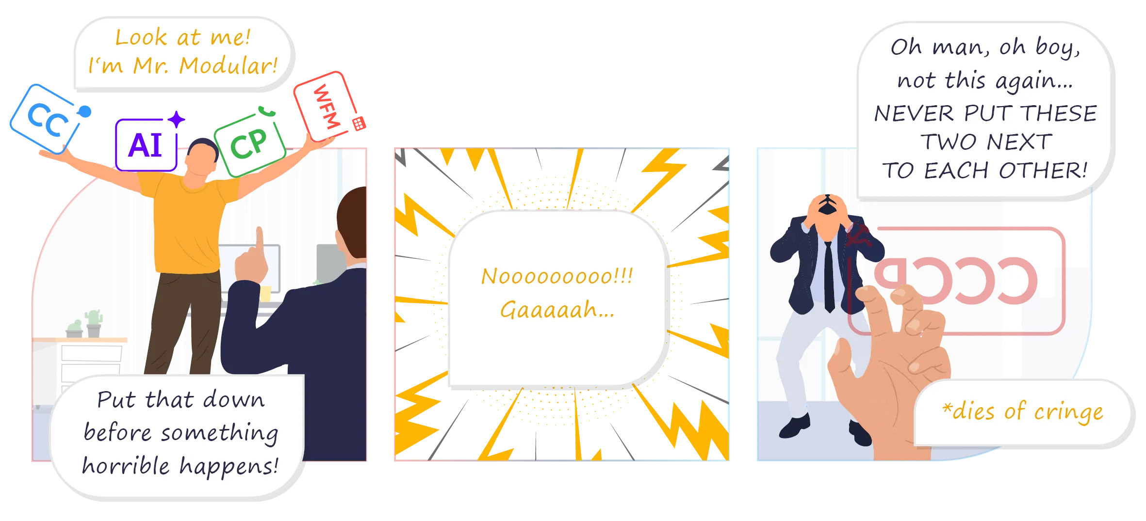
“Don’t play with the logo” is a cornerstone rule in most brand guidelines. It builds consistency, recognizability and trust. “Don’t play with your food.” is a similar rule. If the potato mash next to your cutlet is served in an weavy oval shape, there is a reason for it. The kitchen knows. You shoudn’t make a pyramid or a butter dam or out of it. You know you shouldn’t. You know this... But you did it anyway, didn’t you? At Daktela we believe there is plenty of room for fun even in the most formal places. Instead of having 1 still symbol, we prefer to look at it and think “What more we can make out of it?” Daktela software is anything but rigid and unchanging. So we view and approach our symbol the same way.
There are still some rules
However freestyle our symbol unit is, our logo as a whole has to stay in shape and remain consistent to balance it out. A good logo is like a traffic sign. You can recognize it easily even in the corner of your eye while driving over 130 km/h around it. You woudn’t want to make a STOP sign green and round, now would you? These are standard forms of the Daktela logo. Use it as it is - if the version you’d like is not provided in the download link below, it’s not allowed to exist.
Download Daktela logo in all formats
Got neighbors? Our logo loves to have neighbours of all colors and sizes. But it likes it’s private space too. So be considerate and when using our logo. Think of the area around it as a your own personal zone that nothing should invade without permission. To know how close is too much, take the blue cube in the middle of our symbol and put 2 of them at each direction around the logo. That’s the private space.
Our Claim
Say what you mean and mean it. It’s a good practice when dealing with customers to remind them of our values that directly affect them. Having a fine claim to go with our logo is the right way to do so. Customers matter not only in the business sense but as our core value. Let’s say that loud and proud in our marketing messages – emails, leaflets and anywhere else so that our customers know we’re not here simply to grab their gold coins but to grow WITH THEM.
Show me your true colours
Red Orange
HEX FF5349  RGB   255 · 83 · 73
Midnight Blue
HEX 003366  RGB   0 · 51 · 102
Sky Blue
HEX 66CCFF RGB   102 · 204 · 255
Our primary palette consists of 3 colours.
There are secondary colours too but those are best handled just by designers that download the whole PDF above and see them in detail. For everyone else, these 3 will cover most of your creative endeavours.
Templates for everyone
A4 MS Word template
Download files 
for different languages.
Download templates
Daktela Icons set
Download files 
for different languages.
Download templates
Presentation template
Here are our up-to-date presentations in czech and english language. If you wish to edit them, make a copy of the entire presentation. Additionally - there is a file with various premade assets for your presenting pleasure.