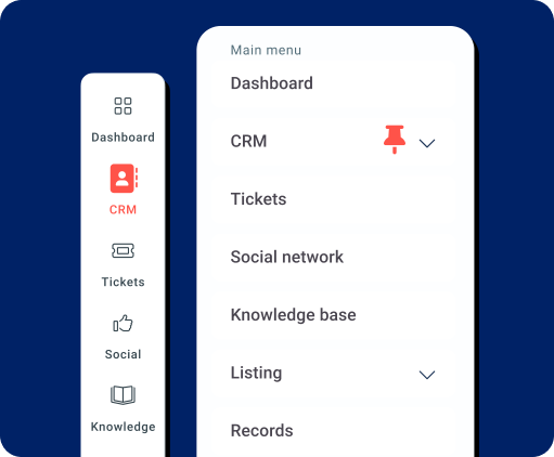
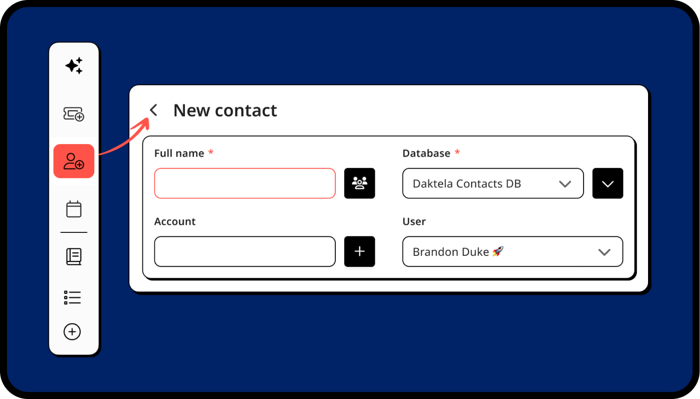
The new right bar and key shortcuts help you work faster - the tools you use most, always within reach.
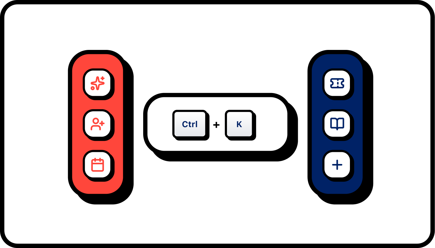
Start new tasks or open AI tools with a single click — or pin your own most-used actions.
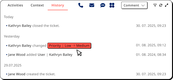
Jump between pages or perform key actions with simple key combos.
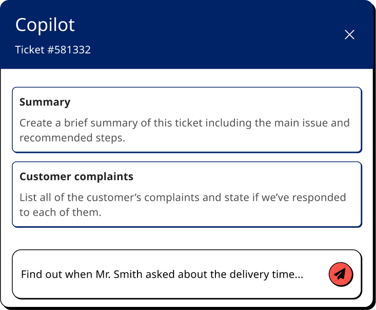
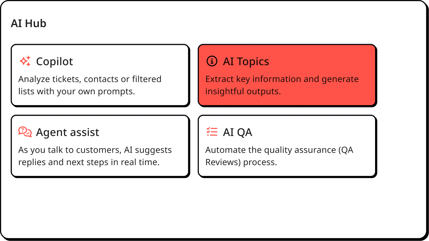


Use AI to analyze tickets, contacts or filtered lists with your own prompts. Results appear in a chat-style view, ready for follow-up.

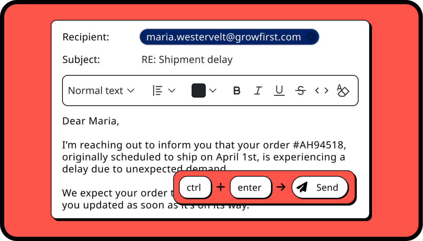
Polish your text in just a few clicks with smarter AI in the editor. Set favorite languages and reuse prompts that fit your tone.
A new hub for all AI tools. Find, set up and manage AI features in one simple dashboard.
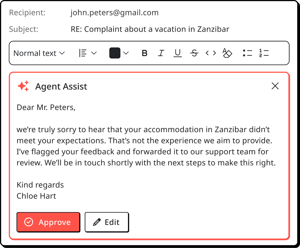
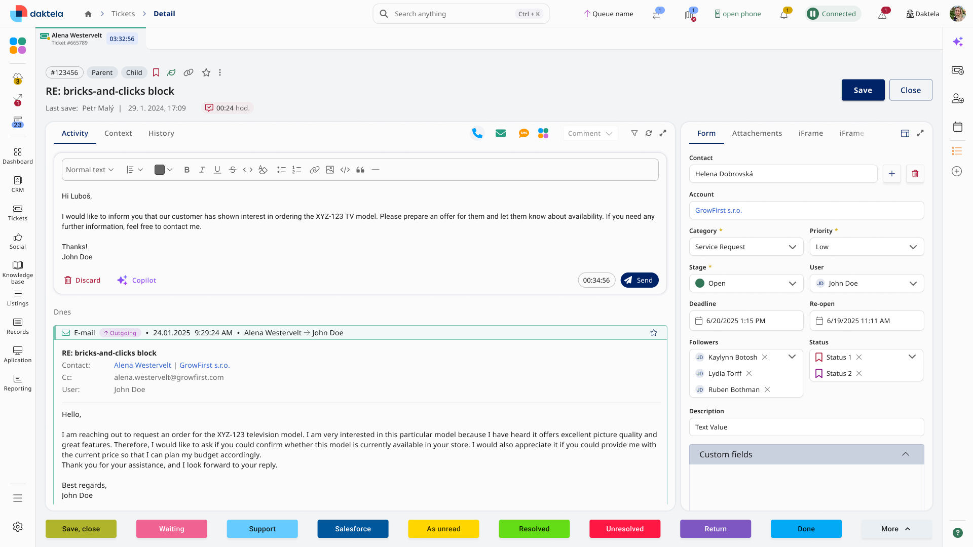
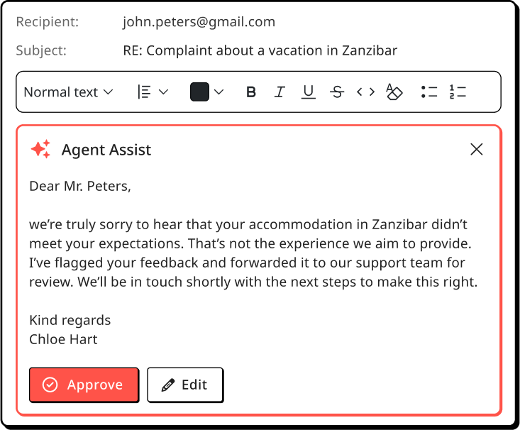
As you talk to customers, AI suggests replies and next steps in real time. Prompts and knowledge base content are used to guide answers.